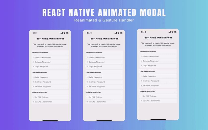
React Native Animated Modal
React Native Animated Modal
🖼️ About - @hyoper/rn-animated-modal
A highly customizable React Native modal component. Perfect for mobile applications, this modal enhances user experience by combining fluid animations with gesture-friendly controls. For full API documentation and usage examples, check out the 📖 API.
✨ Features
- Smooth animations are provided with Reanimated.
- Smooth gestures are provided with Gesture Handler.
- Interactive and customizable backdrop.
- Synchronous pan gestures for scrollable child components.
- Support for FlashList and LegendList components.
🛠️️ Installation
1- Install the package in your React Native project. 🔗 NPM
npm install @hyoper/rn-animated-modal
yarn add @hyoper/rn-animated-modal
2- You must have completed the installation steps for the Reanimated and Gesture Handler packages.
⚙️ Requirements
This package relies on specific versions of its peer dependencies to function correctly. Make sure your project meets the following requirements:
{
"react": ">=18.2.0",
"react-native": ">=0.78.0",
"react-native-gesture-handler": ">=2.26.0",
"react-native-reanimated": ">=3.19.0"
}
The dependencies listed here are optional. You can use FlashList (ScrollableFlashList) or LegendList (ScrollableLegendList) within the modal. Supported versions are as follows.
{
"@legendapp/list": ">=2.0.0",
"@shopify/flash-list": ">=2.0.1"
}
🧩 Example
A simple example of the component's usage is provided below. You can easily customize it to fit your project needs. For more complete examples and real-world use cases, check out the 📂 EXAMPLE.
import React, {useState} from 'react';
import {StyleSheet, Text, View} from 'react-native';
import {Modal} from '@hyoper/rn-animated-modal';
const Example = () => {
const [visible, setVisible] = useState(false);
return (
<Modal
// Modal status is hidden or visible.
visible={visible}
// Use Fade/Scale/Slide animations. (Optional)
animation={{
type: 'slide',
direction: {start: 'up', end: 'down'},
duration: 350,
}}
// Activate and customize the draggable modal. (Optional)
swipe={{
enabled: true,
directions: ['up', 'down', 'left', 'right'],
distance: 120,
velocity: 800,
closable: true,
}}
// Customize the backdrop component. (Optional)
backdrop={{
enabled: true,
backgroundColor: 'black',
opacity: 0.5,
}}
// Triggered when the modal is closed.
onHide={() => setVisible(false)}
// Triggered when the modal is opened. (Optional)
onShow={() => {}}
// Triggered when the android back button is pressed. (Optional)
onBackPress={() => setVisible(false)}
// Triggered when the backdrop is pressed. (Optional)
onBackdropPress={() => setVisible(false)}
// Triggered when the drag operation is completed. (Optional)
onSwipeComplete={() => setVisible(false)}
// Triggered when the drag operation is canceled. (Optional)
onSwipeCancel={() => {}}>
<View style={styles.content}>
<Text>React Native Animated Modal</Text>
</View>
</Modal>
);
};
const styles = StyleSheet.create({
content: {
width: 320,
height: 240,
backgroundColor: 'white',
padding: 20,
borderRadius: 15,
alignItems: 'center',
justifyContent: 'center',
},
});
📜 Scrollables
Use Scrollable components to handle pan gestures in parallel for the Modal and its child components.
- Scrollable (Wrapper) – Show
- ScrollableFlatList (Child) – Show
- ScrollableSectionList (Child) – Show
- ScrollableView (Child) – Show
- ScrollableFlashList (Child) – Show
- ScrollableLegendList (Child) – Show
import React, {useState} from 'react';
import {StyleSheet, Text, TouchableOpacity, View} from 'react-native';
import {Modal, Scrollable, ScrollableFlatList} from '@hyoper/rn-animated-modal';
const Example = () => {
const [visible, setVisible] = useState(false);
return (
<Modal
visible={visible}
swipe={{enabled: true, directions: ['up', 'down', 'left', 'right']}}
onSwipeComplete={() => setVisible(false)}
onHide={() => setVisible(false)}>
<View style={styles.content}>
<Scrollable
// Determine the orientation of the list. (Optional)
orientation={'vertical'}
// Determine whether the list should be reversed. (Optional)
inverted={false}
// Listen to the list's callbacks. (Optional)
onScroll={() => {}}
onBeginDrag={() => {}}
onEndDrag={() => {}}
onMomentumBegin={() => {}}
onMomentumEnd={() => {}}>
{options => {
return (
<ScrollableFlatList
{...options}
data={Array.from({length: 20}, (_, i) => i + 1)}
keyExtractor={item => item.toString()}
renderItem={({item}) => (
<TouchableOpacity onPress={() => console.log(item)}>
<View style={styles.item}>
<Text style={styles.itemText}>Item: {item}</Text>
</View>
</TouchableOpacity>
)}
/>
);
}}
</Scrollable>
</View>
</Modal>
);
};
const styles = StyleSheet.create({
content: {
width: 320,
height: 240,
backgroundColor: 'white',
padding: 20,
borderRadius: 15,
alignItems: 'center',
justifyContent: 'center',
},
item: {
backgroundColor: '#F4F4F4',
padding: 10,
marginBottom: 8,
marginHorizontal: 4,
},
itemText: {
fontSize: 16,
color: '#333',
},
});